FAQs
Where all the questions about design, files and best practices are…
Be sure to keep scrolling!
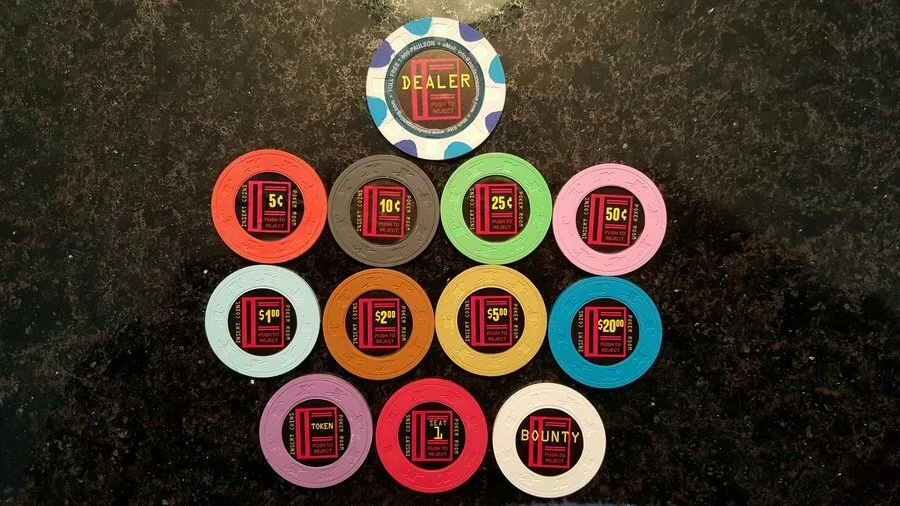
What shapes are available for faux shaped inlays?
Pretty much whatever shape you want. Paulson chips have used a lot of different shapes over the years, and we've made/replicated a few others that aren't used on Paulson chips but still look good (e.g. sawtooth.)
If you're adding a denomination to an existing set (e.g. a 25c chip for a cash set) we recommend choosing a shape that isn't used elsewhere in the set. This is sometimes easy to decide, especially if you're relabelling a different chip from the same set.
For example, if you were to label a Horseshoe Cleveland $2.50 chip as 25c, you could use the same scallop shape as the original chip.
See the below gallery for previous jobs and examples
See the below gallery for ideas.
What chip colours can be matched with a faux shaped inlay?
As long as we have a sample chip in-hand to work with, we can match pretty much any color <as noted above> -- EXCEPT colors that are fluorescent.
Colors such as those in Paulson's fluorescent palette (see list below) or CPC/ASM DayGlo colors, are outside the range of colors that can be reproduced using CMYK inks. This is true not only for our printing equipment, but also for any printing equipment that uses a CMYK ink set.
It's not a matter of it being difficult or tricky to match colors such as these. It is simply not possible to create certain colors with those inks.
Paulson colors that cannot be matched include:
Day Green
Blaze Orange
Arc Yellow
Hot Pink
Mexican Rose
Peach
Salmon
Sherbert Green
Radiant Red
Metallic Silver
Metallic Gold
OK, the metallics aren't fluorescent, but they contain metallic-sparkly-things that ink doesn't contain.
Of course, we can print shades of color that are "somewhat close" to those, e.g. a shade of green that isn't too far off Day Green, but it will never be a near-perfect match. The difference between a printed color and the chip color will always be noticeable.
Why do you keep telling me to not pay attention to the colour on the screen when you send me proofs? How will I know it will come out right?
The short answer: Trust us, it will match. <except for the above noted colours>
We were print nerds before we were chip nerds. Trust in that deep knowledgebase, and need to get it as close to perfect as possible.
All that matters is matching the colour of the actual chip to the ink coming out of our printer. All of this work is done by eye. Making minor adjustments until we are satisfied.
Some works-in-progress from 2018.
I provided the Paulson “official” colour name, you have a sample set…Why are you suggesting I may still want to send samples?
It depends on what level of perfectionist you are.
We are pretty granular in our perfectionism. Paulson chips are a lot like leather. The age of the chip, the moisture content of the material and surface oil can alter the hue of the colour.
Paulson will issue colour samples for current years, and you will see the harder to mix colours will vary slightly from year to year.
So if you are OK with the colour being really close, then no need to send samples. We will match to our Paulson sample set as close to perfect as possible. But depending on the age/vintage of your chip that may be a very slight bit different.
If the colour match needed is the denomination, matching our sample is close enough. The mind plays tricks with colour so if what you are matching isn’t directly touching the colour being matched close enough will work. It is only with the faux inlays this granularity can make a visible difference.
If you are as granular as we are about colour, we suggest sending samples. So that we we can match the colour coming off OUR printer to YOUR exact chips.
Paulson Fantasy Chips
Paulson used the “same colour” for their Viva Las Vegas $50’s and their Casino De Mexico 50’s. Look closely at the base colour of the chip and you will see a colour shift from the VLV to the first CDM and the second CDM. All of these are named “Fuscia” by the manufacturer.
Can you make an exact copy of this live or hard-to-find chip?
No.
We are not comfortable making exact copies of labels, for many reasons.
This applies to all casino artwork, live or closed. Suffice it to say, we are here for the home market only. We want to help chippers customize their personal sets and make them playable.
Replicas? OK
Tributes? OK
Exact copies of valuable chips, live or closed ? Not OK
Expect us to make suggestions of changes to any replica or tribute design. Things like:
Change in place name.
Add the years the casino was open.
Add the word “Commemorative” to the artwork.
We never print anything that looks like it could possibly be a security feature.
Expect us to also turn down requests to print:
Iconic artwork associated with other artists.
The likeness or image of a well known person alive or diseased.
We will make suggestions based on what looks close to the original, or fits in with the general design or motif. We are open to other ideas you have as well.
This is the way that we choose to protect our business from inquiring minds who may take exception to us making money on their artwork or trying to pass off our labels as the real deal.
Do you have a catalog of designs to choose from?
No we don’t, and we do not plan on publishing one.
Since we are 100% print to order, it is up to you to bring your ideas to the table.
Since it is up to every customer to share or not share what they have had made, the best tool to see what we have done in the past is to check out our Testimonials thread on the PCF.
In the immortal words of the Spice Girls…Tell us what you want…what you really REALLY want. (email: ask@gearlabels.com) and we can tell you if we have that artwork already or what steps need to be taken to whip something up.
Can you help me design my label? / Do you do custom design work?
The Short Answer - No, but we partner with a longtime friend who is a is a Graphic Designer by education. He is not a chipper, but has been in the pre-press industry for 25+ years and knows a thing or two. He has unfettered access to Gear to get all the chip related aspects of the design right. We will recommend him to you if you ask.
The Longer Answer - We DO do casino replica/tribute artwork.
If you want to change the text of an existing design, or change out a faux inlay shape of an existing design, we can do that. (a la HSI/JACK) That isn’t what we consider custom design work.
If you want a replica of an existing chip, but just want to change the denomination, we can generally do that. That isn’t what we consider custom design work.
If you want to make a casino tribute label, we can to do that. How long it will take depends on if we have already made that tribute before. If you have seen a tribute set on PCF that you like and want to tweak for your purposes get a picture of that and send it to us to show us what you want.
Best course of action - email Andrea at ask@gearlabels.com and ask her.
She can help assess what you have, what you want, and what we can do. If you are close to having everything you need, she will let you know what you need to go get. If what you are looking for isn’t what Gear Labels can do right now, she will do her best to point you in the right direction for what you want done.
What kind of files do you need for artwork?
Artwork designed and produced in a vector format (AI, EPS, SVG, etc.) will generally give better results than a raster format (PSD, TIFF, JPEG, GIF etc.) To be clear, either type is acceptable, but vector is preferred.
Always send us the native file type from whatever application you’re using. Do not export to some other format just for the sake of changing the format. Most graphic apps are terrible at re-creating each other’s filetypes.
Recommendations for vector files:
Adobe Illustrator (AI), Inkscape (SVG), EPS, PDF
One file with different layers/artboards with all the different denominations is preferred.
Include all the fonts you've used, or links to where you got them. Alternatively, convert all text to outlines/curves. (This depends a bit on the format — note that Inkscape in particular does an absolutely terrible job of converting text to paths.)
Set the color space to CMYK for the document. (Ideally before you begin!)
Avoid RGB black, which is when RGB 0-0-0 is converted to CMYK. The result is not 0-0-0-100 as you might expect, but usually more like 75-68-67-90 … which might look great on a screen, but will print very poorly. (If possible, use a spot color named SpotBlack with recipe 25-25-0-100. This is a “rich” black that will look much better than 0-0-0-100, but won’t be as muddy and over-inked as RGB black.)
Recommendations for raster files:
Adobe Photoshop (PSD), or PNG, TIFF, etc. Lossless formats are recommended over lossy, i.e. PSD, TIFF, and PNG are all better than JPEG.
Higher resolution is better, 300-400 dpi minimum depending on the content. 1200-1600 dpi is best, especially if your design has thin lines or smallish text. However, keep in mind the overall dimensions. Since most poker chip labels are around an inch in size, anything more than about 1600 x 1600 actual pixels is unnecessary.
Include all the fonts you've used, or link to where you got them. It’s often worth the time to re-create the design in Illustrator, and using actual vector text will always look better in the end.
Set the color space to RGB for the document, unless the background is black or mostly black. (Many raster image programs don't handle CMYK 8-bit properly, and you can get weird results.)
It's usually a good idea to send a proof image of what you expect the design to look like, especially if you're designing in non-Adobe software. This is one time when exporting to JPEG or PNG does make sense, so that we can be sure we're on the same page. (If nothing else, just take a screenshot!) A low-res proof is fine, since we'll only be using it to confirm that the design elements are all appearing correctly.
Any Design Tips / Guidelines / Suggestions?
Absolutely.
Always do an “Arm's Length” test.
That is, print out your design life-size (100%) and look at it from arm's length. A lot of very fine detail, very small text, or other finicky stuff will look fantastic on your monitor zoomed up at 1600% ... but in real life, it won't look like much of anything. (Or worse, it will look like smudges or dirt.)
Avoid fonts or text smaller than about 3-4 points. It's just not going to legible.
Avoid thin outlines (less than, say, 0.5 points.) At that size and line thickness, an outline acts more like a subtle color shift than an actual border.
Generally we recommend against an outer ring of contrasting color, or a circle drawn close to the edge of the design.
This is because it's not possible to guarantee 100% perfect alignment between print and cut. The manufacturer's spec for this tolerance is +/- 0.5 mm.
This may not sound very large, but for a line that is very close to the edge of the cut, it can be pretty significant. Even if it's not off by as much as 0.5 mm (i.e. still within spec) the human eye is REALLY good at noticing when two circles aren't concentric.
When printing labels to mimic faux-shaped inlays, this is not really a problem because the outer ring of the label matches the chip base. However when it's a contrasting color or a clearly defined line, if the alignment isn't close to perfect, it can be very noticeable.
Account for Bleed and Safe Zones
If the design has elements (graphics, text, backgrounds) that run right up to the edge, then include bleed of at least 0.050 inch. In other words, make the graphics or color areas 0.050” larger than the final cut size of the label, all the way around.
Similarly, keep a safe zone of about the same distance (0.050”) inside the edge of the label for any element that doesn't go right up to the edge.


